Build Ad Stack
Creating and Optimizing Responsive Ads with Google Ad Manager
min read
May 18, 2026

By
Rohan

Build Ad Stack

A practical guide to setting up responsive ads in Google Ad Manager using GPT tags, breakpoints, and size mapping to deliver fast, device-optimized ad experiences that increase revenue.
With users accessing your content on everything from smartphones to tablets to large desktop screens, ensuring that ads look appropriate and perform well on every device is a critical aspect of any publisher’s strategy. Responsive ads are more than just a trend — they are a practical solution that allows ads to be served in sizes suitable for different screen dimensions, delivering a consistent and high-quality user experience.
However, simply enabling responsive behavior isn’t enough. You need to understand how responsive ads are set up in Google Ad Manager, how ad units and size mapping work, where to apply breakpoints, and what mistakes to avoid to achieve optimal results. When implemented correctly, responsive ads can improve user engagement and help maximize ad revenue.
Whether you’re refining an existing setup or starting from scratch, the following insights and strategies will help you navigate the process of implementing responsive ads in Google Ad Manager. Before diving in, here’s a quick refresher.
Responsive ads are designed to serve ad creatives that fit appropriately within the available space on different devices, including desktop, tablet, and mobile.
Rather than resizing a single creative, Google Ad Manager selects from predefined ad sizes that are eligible to serve in a given placement. This ensures users experience a consistent ad presentation that aligns with their device and screen size.
For example, a display placement may support larger banner sizes such as 970×250 or 728×90 on desktop screens, while serving 300×250 or 320×50 creatives on mobile devices. The creative itself does not dynamically resize; instead, Google Ad Manager delivers the most suitable size based on the available space and configuration.
The flexibility of responsive ads comes from how ad units, creatives, and size mapping are configured. Depending on the placement and layout, an ad may appear as a display banner in one context and as a native-styled unit in another, provided the appropriate creative types and sizes are defined.
To get started, log in to your Google Ad Manager account and navigate to the Inventory section.
Responsive ads in Google Ad Manager are built around ad units, line items, and creatives. Begin by creating or selecting an ad unit where you want responsive ads to appear. When defining an ad unit, include all ad sizes that may be eligible to serve in that placement across different devices.
Your inventory setup should reflect how the placement behaves within your site layout on desktop, tablet, and mobile. The goal is to allow Google Ad Manager to select from multiple eligible sizes depending on the available space, not to scale a single creative to fit all screens. Monitoring google ad manager metrics during this process can help you identify which ad sizes and placements perform best across devices.
Once ad units are created, line items can be configured to target those ad units. Each line item delivers creatives that match the eligible sizes defined in the ad unit and any applicable size mapping rules.
The next step is to integrate Google Publisher Tags (GPT). GPT is a JavaScript tag that defines ad slots on your site and enables responsive behavior by selecting from predefined ad sizes.
GPT does not resize creatives. Instead, it evaluates the available viewport or container size and requests an ad size that has been explicitly defined in the ad unit and size mapping configuration.
To get started, generate GPT while setting up your ad units. A basic GPT implementation includes a head tag and a body tag.
A simple GPT head tag looks like the following:
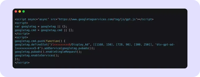
And a sample body tag looks like this:

Note: Ensure that ad units in Google Ad Manager include all intended sizes, such as 970×250, 728×90, 300×250, and 320×50. GPT will only serve creatives that match the sizes defined in the ad unit.
Ad size mapping is a crucial step in configuring responsive ads. It defines rules that determine which ad sizes are eligible to serve based on the user’s screen or viewport size.
Ad size mapping involves two primary functions:
Here’s an example of what a size mapping snippet looks like:
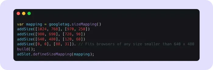
In this example, [1024, 768] represents the browser viewport size, while [970, 250] represents an ad size that can be served at that breakpoint.
This means that when the browser viewport meets or exceeds 1024×768, a 970×250 creative may be served. Smaller viewports will use other mapped sizes.
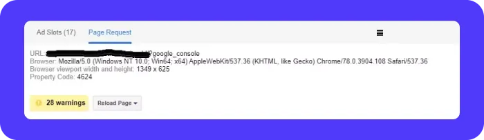
Note: You can use the Google Publisher Console’s Page Request tab to view the browser viewport width and height.
Google Publisher Tags automatically detect the browser size and use the defined size mapping to select the most appropriate eligible ad size.
If you want to define a default behavior, [0,0] can be used to allow an ad size to serve for any viewport not explicitly mapped.
Before implementing GPT, define breakpoints that determine how ad sizes align with different screen widths. Breakpoints help Google Ad Manager decide which ad sizes are eligible to serve in a given context.
Common breakpoints include:
Assign appropriate ad sizes to each breakpoint using ad size mapping. For example:
This ensures that ads are served in sizes that align with the layout, rather than attempting to resize a single creative.
If you choose not to serve ads on certain devices, size mapping can be used to suppress delivery for specific viewport ranges.
After configuring size mapping, test ad delivery across multiple devices and screen sizes. Use browser developer tools or real devices to verify correct behavior and adjust mappings as needed.
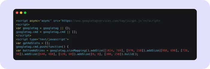
Once size mapping is defined, link it to the ad slot in your GPT header tag.

A complete GPT setup that supports responsive ad delivery follows this structure:
In summary, responsive ads in Google Ad Manager rely on generating GPT, defining ad size mappings, and linking those mappings to ad units. Google Ad Manager then selects the most suitable eligible creative size based on the user’s device and available space.
Optimizing responsive ads helps ensure a seamless user experience and strong ad performance.
Responsive ads offer clear advantages, but misconfigurations can limit their effectiveness.
While responsive ads help ensure the right ad sizes are served across devices, they must also be implemented in a way that preserves layout stability. One of the most common issues with responsive ad setups is unexpected layout shift, where content moves as ads load or change size. This can negatively impact user experience, especially on mobile devices.
To avoid this, always plan your responsive ad placements with layout consistency in mind. Ad containers should reserve enough space for the largest eligible ad size defined in the ad unit and size mapping. This ensures that when an ad is rendered, it does not push surrounding content out of position.
When using ad size mapping, avoid dynamically changing the height of the ad container after the page has loaded. Instead, define container dimensions that can comfortably accommodate all eligible ad sizes for that placement. This is particularly important for placements that switch between larger desktop sizes and smaller mobile sizes.
It is also essential to test responsive ad behavior under real-world conditions. Resize browser windows, test split-screen views, and load pages on mobile devices to confirm that ads appear without causing content shifts. If layout movement occurs, review the size mapping rules and container dimensions to ensure they align correctly.
By reserving space upfront and aligning ad sizes with stable layout containers, responsive ads can deliver flexibility without disrupting the user experience. This approach helps maintain a smooth reading experience while still allowing ads to adapt across different screen sizes.
Responsive ads play a vital role in modern digital advertising by ensuring ads are delivered in formats suitable for different devices and screen sizes. By correctly configuring ad units, size mappings, and GPT, publishers can create a reliable and adaptable ad experience.
This approach not only improves user satisfaction but also supports stronger ad performance and long-term revenue potential. Responsive ads are not about resizing creatives — they are about delivering the right creative size in the right context.
By embracing this strategy and maintaining a well-structured inventory setup, publishers can stay adaptable and continue to provide high-quality ad experiences across an evolving device landscape.
Ad size mapping links browser viewport sizes to the ad sizes that GAM is allowed to serve. With .sizeMapping() and .defineSizeMapping(), you can assign multiple sizes for desktops, tablets, and mobile so ads always fit the available space. It prevents stretched creatives and improves responsiveness.
High-performing responsive ad sizes include 300×250, 336×280, 728×90, 320×50, 160×600, and 970×250. Using IAB-standard sizes increases fill rate, enables better demand compatibility, and ensures cleaner rendering across phones, tablets, and desktop layouts.
Breakpoints let GAM serve the most suitable ad size at each screen width, improving loading behavior, reducing layout shifts, and boosting both engagement and revenue.
Publishers should test responsive ads using browser dev tools, device emulators, and real devices. Checking how ads load at each breakpoint helps identify misaligned sizes, missing fallback units, or scripts that cause layout shifts or delay loading, issues that affect viewability and Core Web Vitals

.webp)


.avif)
.avif)


